Enhancing User Engagement Through Effective Notifications in Farm Management Apps @KisanHub
Improved user engagement by understanding user needs and behaviour

Published At
11/20/2019
Reading Time
~ 5 min read
Introduction
The modern farming landscape is undergoing a digital transformation, revolutionizing how growers manage their daily activities. A crucial element in this transition is the effective use of technology to streamline operations and provide timely advisories. However, a significant challenge arises when users do not engage regularly with farm management applications, resulting in a disconnect between the technology and its potential benefits.
This article delves into the journey of enhancing user engagement through effective notification systems, exploring both the challenges and solutions involved in bridging the gap between users and technology in farming.
The Challenge: Low Engagement and Ineffective Notifications
In the realm of farm management, keeping growers informed and engaged is vital. Users often struggle to receive regular updates about farm advisories, predictions, and completed tasks, primarily due to ineffective notification systems. These notifications, when overlooked, can lead to inaccurate predictions in critical areas such as irrigation, soil moisture, pest, and disease control.
Our primary goal was to revamp the notification system to retain users and improve their engagement with the app. Initial analysis revealed a low opening rate of notifications, prompting a redesign to make them more user-friendly and informative.
Current State Analysis
Business Goals:
KisanHub, a platform connecting enterprises with growers, aims to enhance agricultural efficiency through data-driven insights. However, this goal faces hurdles when growers do not update crucial information, leading to suboptimal predictions and advisories.
The business objectives include:
- Retaining existing users
- Keeping team members informed
- Encouraging completion of tasks
- Fostering partnerships among growers, agronomists, and enterprises
User Goals:
Users, primarily growers, seek to:
- Stay updated on field events
- Easily access advisories and predictions
- Efficiently execute tasks recommended by agronomists
- Access recent reports and articles shared by enterprises or agronomists
Balancing these user and business goals requires a nuanced approach to redesign the notification system.
Undertaking the Redesign: A Designer's Perspective
As a designer, my objectives were to create an engaging, intuitive, and empathetic user interface. This involved learning and applying user research, creating wireframes, and conducting design sprints. My roles encompassed user research, data analysis, product and UI/UX design, and product management.
Research and Redesign
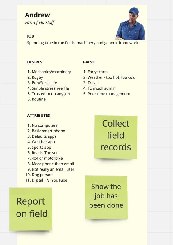
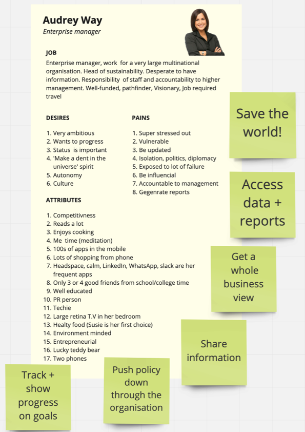
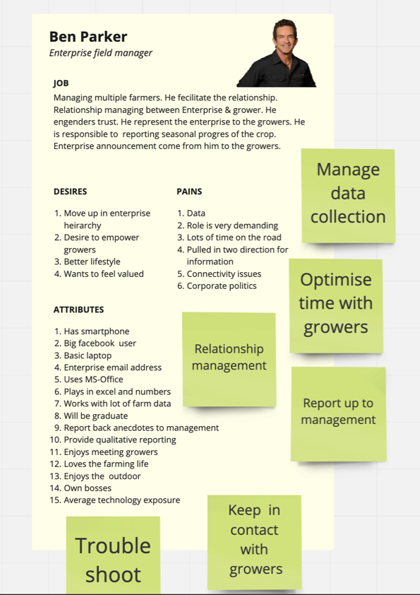
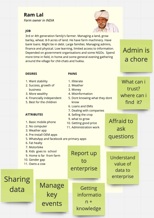
Identifying User Personas
Understanding our user base was crucial. We developed personas representing typical growers and their motivations for using the app. This helped tailor the redesign to actual user needs.


Main Issues Identified and User Pain Points

- Content Overload: The information was cluttered, lacking clear categorization or filtering options. This made it difficult for users to find the specific information they needed, leading to frustration and inefficiency.
- Lack of Priority: Urgent actions did not receive sufficient emphasis, resulting in user inaction. Important tasks and notifications were not highlighted or prioritized, causing users to overlook them and potentially miss critical updates or deadlines.
- Confusing Voice and Tone: The notifications were unclear, and the action buttons were confusing. This led to user confusion and hesitation when trying to interact with the system. Clear and concise messaging with user-friendly language would greatly improve the overall user experience.
- Inaccessible Navigation: The placement of the notification section under the side-nav in the top left corner was inconvenient for users. This made it difficult for users to access and manage their notifications quickly and easily. A more accessible and prominently placed notification section would improve user satisfaction and efficiency.
- Slow content loading times: The slow loading times of the content added unnecessary waiting and frustration for users. Improving the performance and loading speed of the system would greatly enhance user experience and productivity.
UX Suggestions and Redesign
The redesign focused on simplifying the user interface and improving notification clarity. This included:
- Clear voice and tone for notifications
- Progressive disclosure of information
- Highlighting urgent actions
- Minimalist design approach
Sketches and prototypes were created to visualize these changes.

Overcoming Translation Challenges
One significant hurdle we encountered during the redesign process was addressing the translation challenges for our multilingual users. We recognized the complexity of translating notifications, especially when it came to maintaining the appropriate voice and tone across languages such as English, Hindi, and Marathi. To overcome this challenge, we took a meticulous approach by carefully rewording the notifications and conducting extensive testing to ensure their effectiveness and clarity in different languages.
Reflection and Conclusion
In UX design, the goal is to create a product that is not only functional and user-friendly but also brings joy and satisfaction. This journey in redesigning the notification system was a testament to that, blending the art of design with the science of user behavior.
The redesign aimed to enhance user engagement by making the app more intuitive and informative. The learning process was continuous, evolving with each user feedback and iteration.
We hope this redesign will not only help growers stay updated and complete tasks efficiently but also foster a stronger connection between them and the technology that aims to make their lives easier.
🔕
Do you have any questions, or simply wish to contact me privately? Don't hesitate to shoot me a DM on Twitter.
Have a wonderful day.
Abhishek 🙏